

The word “infographic” is a condensed compound of information and graphic. Fairly self-explanatory, infographics are visual representations of data or knowledge with the intention of presenting information clearly and concisely. They can help us make sense out of patterns or trends
If you think about it, the first infographics were created well before computers and the Internet came about. Thousands of years before in the form of ancient cave paintings and Egyptian hieroglyphics. The original purpose was to tell a story of some kind, to relay information. The more modern relatives of today’s infographics took more of a chart and graph form but still fulfilled the purpose of visually communicating information.
One step further brings us to Edward Tufte, an American statistician, artist, and Yale professor who is considered the father of modern data visualization. Tufte believes that graphical displays should reveal data and encourage the reader to focus on the substance rather than the methodology, technology of the graphic or anything else. Among other things, he definitively states that these displays should avoid distorting the data as it is revealed at multiple levels of detail.
And now, today, as people have moved infographics away from Tufte’s quantitative approach to more qualitative methods, there is a myriad of software and web-based tools that allows anyone to create infographics of all types. Visual representations of knowledge and data, modern infographics provide a break from blocks of text and splashes of color in a world of black and white.
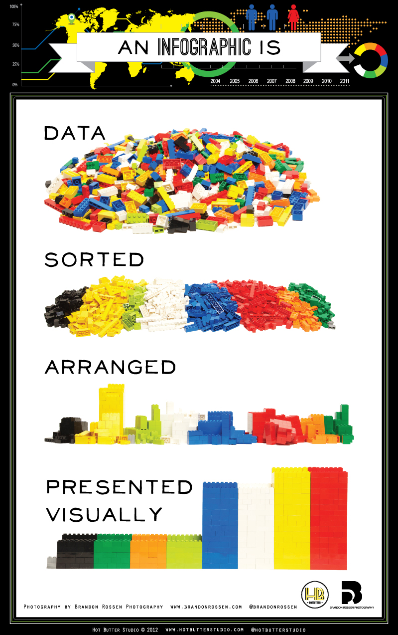
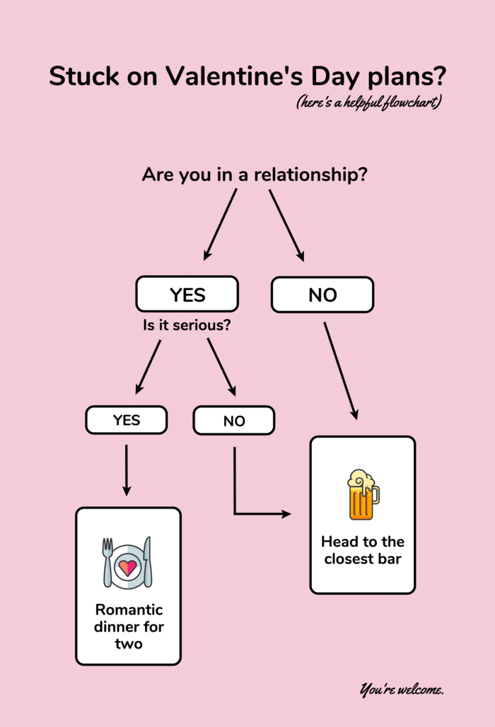
There are many ways to present infographics but there are three main categories that encompass most. The first is data visualization which is, simply, a visual representation of data. Example 1 below, from visual.ly, is representative of an infographic that would fit into the data visualization category. The second category is information design which often take the form of flowcharts, timelines, and organizational diagrams. The tongue in cheek flowchart in Example 2 demonstrates an information design infographic. The third category of infographics is editorial infographics. These are designed to have mass appeal and utilize a narrative approach and are often found in magazine or newspaper articles. Example 3 is an editorial infographic from an edition of Golf World.


Unfortunately, just because tools exist and are available to the general public doesn’t guarantee that everyone’s efforts will result in the successful creation of an infographic. The act of adding some images to a blog post doesn’t make it an infographic. There should be thought behind the design and a logical flow of your narrative. Create a visual hierarchy with the use of color and font size to keep your graphical display scannable. And be sure to match the tone of your voice to the tone of your topic.
The following are additional suggestions to help your infographic effort be as successful as possible.

Infographics appeal to the visual nature of human beings. They, theoretically, provide information in a creative way and can be a powerful marketing tool. Infographics can be easily repurposed, shared across different platforms, and direct traffic back to your website. Don’t forget to make sure your infographics are saved in the proper format (JPG or PNG if going on the web) and that the file is appropriately sized!
The graphic design experts at Strategy Driven Marketing love a great infographic. Whether you’ve tried to create your own visuals and are less than satisfied with the results or you would rather dedicate your time to other aspects of your business, we can help. Contact us today, whatever your marketing needs may be. Let’s get started!