
Have you ever tried to use your business’s website as if you were a customer? As a mobile user? If you haven’t, you may want to put aside this article for a moment and edify yourself before finishing the read.
Google began heavily favoring mobile-friendly websites after it updated its ranking algorithm in April 2015. The search engine giant then started indexing mobile sites in March 2018. The focus on mobile will continue to grow and brands that have yet to improve their mobile experience will find themselves falling behind in search rankings.
Statista states that mobile users have consistently accounted for almost half of all web traffic since 2017 and that statistic doesn’t even include tablet users. If a mobile-friendly website is not on your radar, it’s time to put it there. Mobile friendly, mobile optimized, and responsive design are related and yet distinct concepts. If your company is looking to reevaluate an existing website or develop a new one, a little background of the differences between these terms surrounding mobile will be helpful when the terms come up in development discussions.
MOBILE FRIENDLY WEBSITE
According to Impact, almost half of responders to a survey said they are frustrated and annoyed when using websites that are poorly optimized for mobile devices. 52% of consumers indicated that a poor mobile experience would make them less likely to interact with a business. Furthermore, they found that when a site isn’t optimized for mobile, consumers are 5 times more likely to abandon the task they are trying to complete.
A mobile friendly website is often a more basic version of the desktop version of the website. Mobile friendly sites display accurately regardless of whether they are viewed on a desktop or a laptop computer, tablet, or mobile phone. A mobile friendly website displays the same way on all devices because it doesn’t rely on mobile operating systems. Nothing is hidden and images are scaled based on the size of the device being used.
Some essential design features for ensuring that your website is mobile friendly include:
Reduced image sizes: this allows for quicker loading over mobile connections
Text-based phone numbers, physical addresses, or email addresses: this allows site visitors to trigger a call, directions, or email message directly from their mobile device
Slideshows or image rotators that don’t require Adobe Flash support: this Adobe software isn’t supported by some mobile devices.
A mobile friendly website is considered the bare minimum mobile design strategy any brand should have for its website. That being said, these websites were originally designed for desktop users and while they may be functional, they don’t provide the highest level of user experience for mobile users.
MOBILE OPTIMIZED WEBSITE
A website that is optimized for mobile will reformat itself for certain handheld or tablet devices depending on the browser or device being used. This reformatting offers larger navigation buttons, differently optimized images, and a reformatted presentation of text-based content. Mobile optimized websites are more advanced than mobile friendly websites as they allow users with smaller screens to easily navigate and engage with the sites.
Some essential design features for ensuring that your website is mobile optimized include:
Thumb-friendly navigation: this means simplifying navigation by offering large touchpoints that are located in areas easily reached by a user’s thumb
Fewer graphics: on a smaller screen, copious amounts of graphics can hinder a user’s search for critical information
Smaller image file sizes: this allows for quicker load times
Limited need for typed information: simply put most people’s fingers are bigger than any key on a mobile phone keyboard and even on a tablet, letter keys can be cumbersome to hit accurately
Single column layout: people have become accustomed to vertical scrolling so best to present content in one long column
Offer your desktop version: especially if the desktop version of your website preceded other versions by any length of time, you’ll find that some users just prefer to stick to that version and will appreciate the option.
A well designed mobile optimized website will be uncluttered to the point of minimalism. The goal of such a site is to provide a high level of user experience for mobile users and allow them to quickly and efficiently access information on their device.
RESPONSIVE DESIGN WEBSITE
Responsive design is entirely flexible regardless of the type of device being used to view the site. Websites that are responsively designed literally respond to the screen size of a user’s device, unlike mobile optimized sites that react to the specific browser or device type. Responsive design utilizes a combination of reformatting and re-optimizing to present all aspects of the site.
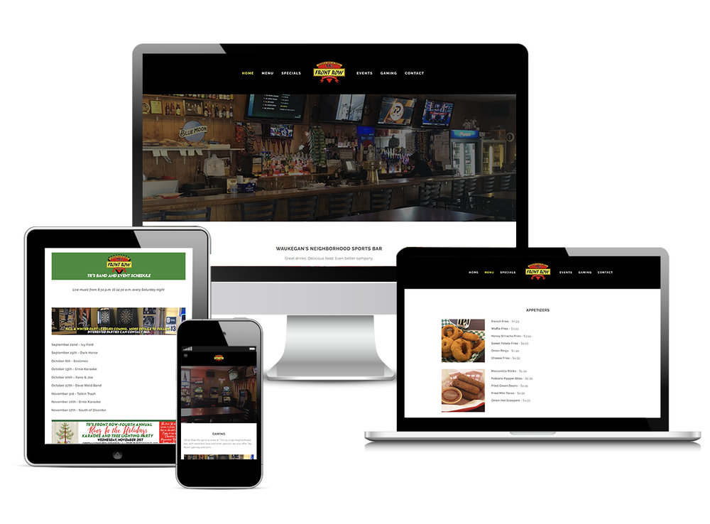
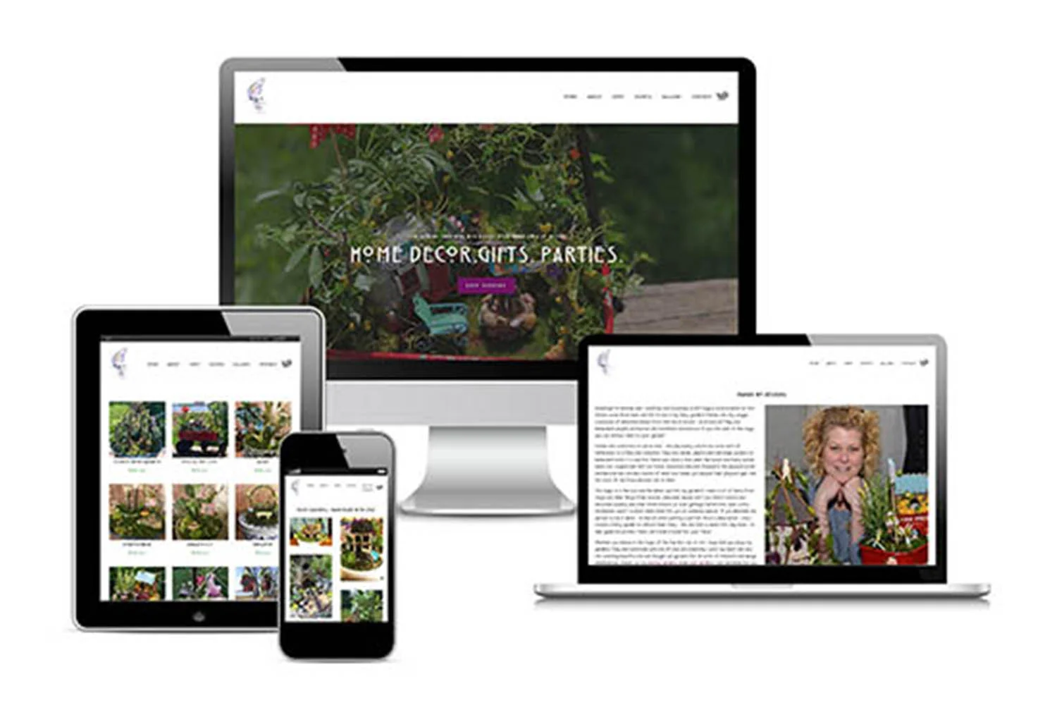
Responsive design provides amazing flexibility and usability for all site visitors. Website hosting platforms like Squarespace offering responsive design website templates. This allows businesses and web designers alike the opportunity to place their focus elsewhere without having to worry about what their site will look like on variously sized screens. Here is an example of a website and how it looks on different devices.
MOBILE FIRST DESIGN STRATEGY
Worldwide mobile and tablet usage exceeded desktop usage for the first time in 2016. Businesses that existed prior to the onslaught of mobile phone usage have often made the choice to create separate versions of their brand’s website instead of developing a completely new site. While mobile-optimized and responsively designed websites can offer a positive user experience, brands may want to consider bringing out a new site created with a mobile first design strategy.
Mobile first is what the name says - a design strategy in which the mobile version of the website is designed before the traditional desktop version. This approach results in a cleaner design structure and provides an excellent base. It is relatively easy to add more features into the desktop version if desired. Much more so than either trying to cram everything into a mobile version or eliminating desktop components that may result in a less effective website for mobile users.
Your website is the 24/7 face of your brand. It is one of the most cost-effective ways to grow your reach, increase your brand awareness, and market your business. A site with top-notch user experience is paramount to a positive and effective online presence. Understanding the purpose of your website and the type of experience you want visitors to gain from it will help you better decide what type of design is best for your business and your website.
The better you can meet the expectations of your target audience, the more likely you are to increase conversions. Extra optimization to functionality and usability provided by a website that was responsively designed or mobile-optimized will have a better chance of increasing your ROI than a site that is simply mobile-friendly.
The experts at Strategy Driven Marketing have extensive experience implementing best practices for website design and development. We’ve worked with organizations of all sizes and across a variety of industries. Our team can help you offer a high-quality responsive website that features all of the modern technology bells and whistles, boasts engaging content, and clearly communicates your brand’s value proposition. Contact us today to get started!